
The brief
To produce a poster (297mm x 420mm) that celebrates a colour of your choice.
Choose a colour that has a meaning that you want to explore and celebrate. Think about
what the colour you have chosen means both to you and to other people and create
something that celebrates that meaning, for example you may choose a golden brown
because you like real ale, a vivid green because of a particular landscape, green to celebrate
Irish identity or the yellow sandstone of Bath’s architecture..
Requirements
Work only with your chosen colour, its complementary colour and black and white. You can
include text, collages, illustrations and photographs. Use black and white to help establish a
range of tints and shades with your chosen colour. These limitations are to get you to work
with colour thinking creatively about how to make a limited palette work for you.
This project is as much about visual dynamics and contrast as it is about creating something
with meaning. Make full use of it to show off to your tutor all the skills and processes you
have learnt so far.
You need to submit at least three variations of your poster as well as the finished artwork.
Introduction
This blog entry describes my approach and results to assignment four. I cover the analysis I performed, research I undertook, the ideas I developed and my final results. I also reflect on the results using the OCA assessment structure and summarise what I have learned through this work.
Analysis
I started the assignment by analysing the brief. I used mind-mapping as a means to start structuring my thoughts,
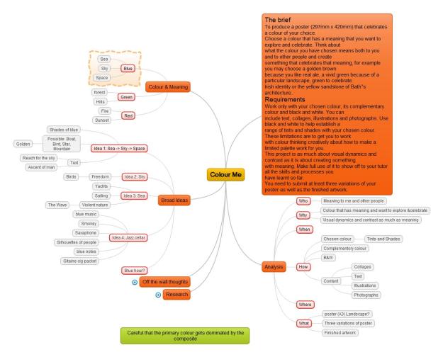
(Click to enlarge)
After this analysis I thought about the colour I wanted to celebrate. I considered a number of colours that have a strong significance for me but settled on blue as having a broad and deep set of associations for me. I then considered how I would celebrate the colour. My initial ideas centred around sea, sky, space. I started to think how I might bring all three aspects – beyond seeing the three areas as having different shades of blue I did not see any clear subjects. I decided that this idea was too complex and decided that I should focus on just two or maybe only one of the subjects. I thought further about these and some rudimentary ideas started to emerge but I had an underlying concern that what I was working on was too clichéd. Whilst going for a run I suddenly remembered an experience I had when I was in my early twenties, many decades ago. I had just moved to France and was invited to go to a Jazz club located in a cellar. This was a fantastic experience for me and made a lasting impression. I decided to use this as the basis for this assignment. The deep blues of the light in the cellar combined with smoke, audience, lights, musicians and instruments seemed a worthy subject.
I had already started performing research but now shifted emphasis towards my chosen subject.
Research
I researched the following areas:
- Colours (Analysis)
- Artists as sources of inspiration (Analysis)
- Sea, Sky, Space posters (Analysis)
- Jazz posters (Developing ideas)
- Fonts (Developing ideas, Results)
I continued research as I developed ideas (e.g. fonts) but for clarity I will record all my findings here but indicate where in the process the main research took place. I recorded source information in my electronic notebook ( Assignment 3 – colour me ) samples in sections below
Colours
I started by using Adobe Color and its colour wheel to select the blue, possible shades and tints plus complementary colour, see below. Using this tool had the advantage that the colours could be used automatically within Photoshop, the tool I had decide to use to create the posters.


(Click to enlarge)
Artists as sources of inspiration
Prompted by the exercises Graphic Designers and Photomontage I decided to look into artists that I might take inspiration from. I started looking again at graphic designers but decided that I would rather look at artists that I had started to explore as being part of (or close to) the surrealism movement. Explicitly I looked at: Salvador Dali, Hans Erni, M.C. Escher and Rudolf Mirer (local well-known Swiss artist) (dalipaintings.com, n.d.; Mcescher.com, n.d.; Poster-auctioneer.com, n.d.; Galerie Mirer, n.d.). Raw data and some analysis I kept in my electronic notebook. An example is here:

I looked at a number of their works (some examples below) and from these I tried to deconstruct why I found them interesting, trying to pay attention to the visual dynamics.
Examples of works reviewed.
-

- Dali
-

- Erni
-

- Escher
-

- Mirer
(Click to expand)
My key findings were:
Salvador Dali: I like the clarity and cleanness of his images, bright colours and, of course, the surrealistic aspects through interesting juxtaposition of subjects.
Hans Erni: The use of decorative elements, mainly curves, that add a somewhat mysterious aspect as well as movement. The splash of colour and dynamic postures.
M.C. Escher: The clever mathematical approach to design, symmetry and the way the images draw the eye in.
Rudolf Mirer: Simple use of colours, stylised images and decorative lines (mainly straight).
From this analysis I decided on the following aspects that I wanted to take into my designs:
- Use of decorative elements
- Simplicity of imagery
- Bold colours (also part of the brief)
Sea, Sky, Space posters
As I was considering whether to create a poster celebrating one, part or all of Sea, Sky, Space I did some elementary research into posters that had used some of these aspects. (Galerie123.com, n.d.)


(click to enlarge)
My initial (and relatively superficial) findings were the following:
- Sea, sky, space in posters were most often supporting elements to other subjects.
- Blue was not always the primary colour, for example sky often had red or orange, as part of a sunset.
- Many of the images were very cliché-ed e.g. boat sailing off into the sunset.
Jazz posters
Having decided on jazz being a major part of the poster I looked at a number of jazz posters (Galerie123.com, n.d.). I did some general research to see what seemed to be the general approach, but also looked specifically at posters that appeared to be valued by the industry.
The following are my conclusions:
- Most posters were focused on specific musical events with highlighted artists
- Dark colours (often blue) dominated
- Fonts were mixed with a number of neutral sans-serif or decorative/script. Titles were often upper case. My feeling was either the text was important in which case it was decorative or script, or it played a secondary role in which case a plainer font was taken.
Some examples of posters I looked at


(Click to enlarge)
Fonts
I was troubled by which style of font to use. I very much appreciate the classic styles(Univers, Akzidenz-Grotesk, Garamond) but wondered whether a more decorative font would work better. I am still learning about fonts and know that it will be looked at later in the course so I am aware of my current ignorance. I therefore went more on gut feel than informed knowledge! I primarily used Adobe Fonts to look at a number of fonts and made the decision that I would keep to a plain, classic font. My reasons were:
- Decorative or script fonts were too dominant and detracted from the rest of the poster
- I just liked the look of the more classic fonts
Some fonts examined in Adobe fonts (and other sources):


(Click to expand)
Developing ideas
Influenced by my research and my personal tastes I tried to establish the design concepts that would steer my design. I came up with the following:
- Timeless (influenced by love of the classic Swiss designers). This was a balance where I wanted to indicate age (1970’s) and foreignness
- Muted surrealism
- Clean, simple graphics, with clear fonts
- As required, focus on creating a visual dynamic
- Make poster portrait (I believe the requirements are non-specific)
I started by drawing a number of initial ideas in my sketchbook, example below.
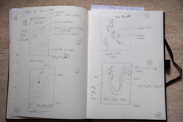
(Click to enlarge)
I then decided to develop further by making quick mock-ups in Photoshop. In order to do this I looked for graphics that were labelled as available for reuse. I was strongly influenced by Erni’s and Mirer’s use of decorative elements so I included a golden ratio as decoration. I hope this also echos (or even influences) the way that the eye might view the poster. The text I choose was La note bleue (blue note). This is a jazz term (En.wikipedia.org, n.d.) and also mimics my choice of colour.
I quickly created six versions of the poster (based on initial drawings) that illustrated different approaches. With the final attempt I deliberately went against my initial design guidelines (rules are meant to be broken!) and tried to create something different, possibly more contemporary. The posters at this stage were inconsistent in colour, with a number of photoshop errors. I did not want to spend time then correcting these errors but use this initial mock-ups to decided which posters were worthy of progressing.
Thumbnails of initial poster design ideas
-

- Poster 1
-
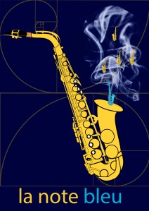
- Poster 2
-
- Poster 3
-

- Poster 4
-

- Poster 5
-

- Poster 6
(Click to enlarge)
I looked at these in detail and removed poster 6 from further considerations. The reasons were: it appeared messy and did not have a clear focus, adversely affecting the dynamics of the image.
The remaining designs I developed further e.g. ensuring consistent use of colour, improving layout. I also experimented with layout, sizes and types of fonts. Some examples are below:
-
- AR Christy
-

- Smaller point Neuzeit Grotesk
-
- Neuzeit Grotesk
-

- Baskerville
-
- Rotated Horizontal font
(Click to expand)
This work was done in Photoshop where I am still something of a beginner (though improving) and this required a number of experiments and learning before I got the effects that I wanted.
I developed these to a point where I considered further feedback would be beneficial. In addition, I know that I need distance (time) to a particular piece of work in order to make more objective judgements. I created a blog entry showing my work so far and requested feedback from a number of sources (OCA Level 1 graphic design students, the OCA region Europe cross-disciplinary group and my family).
Feedback
I summarised the feedback as:
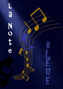
- Poster 1: Moody, good use black and white. A favourite. Works well. A favourite, is the figure visible enough?
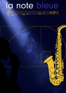
- Poster 2: mini saxophones too much, not subtle. Smoke works. Mini sax’s kitsch. Don’t like small sax’s
- Poster 3: Focus is music, sax too far to right. A favorite but look at font. Don’t like horizontal scale nor silhouette.
- Poster 4: Good use Black and white. A favourite. The crowd looks too static. Like but is blue note too dark?
- Poster 5: Focus on music, good poster. Focus on music. A favourite but is scale too big and is silhouette visible enough?
- Check that yellow/orange is complementary to the blue
- Careful that the use of yellow dominates blue.
- Consider other fonts
- Blue works well for theme. Shaft of light good. Good colour choice.
- Posters look professional!
Further development
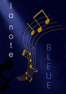
Based on this feedback plus my own views I decided to progress four posters ( Posters 1, 3, 4, and 5) and make Poster 1 my submission. My rationale was:
- Poster 2: I and others felt that the motif of saxophones for music notes was too much of a cliché.
- Poster 1 is my (and others’) favourite. I think it emphasises the overall club atmosphere more than the other posters, where the music is more to the fore.
I revisited the posters and made some changes based on the feedback. I revisited my colour choice and use of fonts but decided that I was happy with my original choices.
Results
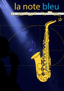
My submission

(Click to expand)
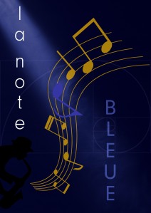
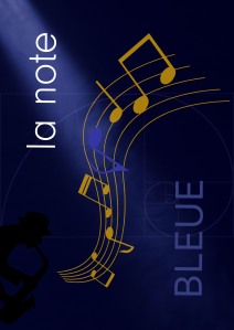
Variants of poster

(Click to expand)
Discussion
Reflection
This section is a summary of the points from above and from supporting log entries. Now that I have two courses behind me (Photography: Expressing Your Vision, and Context & Narrative), I use them as a reference. I have tried to quantify this work by a rating (marks out of ten) in comparison to my previous Photographic EYV, C&N work, Graphic Design and using the overall result from these courses as a guide. I am not attempting to compare against other students working on the same course.
I will also use the OCA assessment structure of:
- Demonstration of technical and visual skills – Materials, techniques, observational
skills, visual awareness, design and compositional skills. (40%) - Quality of outcome – Content, application of knowledge, presentation of work in
a coherent manner, discernment, conceptualisation of thoughts, communication of
ideas. (20%) - Demonstration of creativity – Imagination, experimentation, invention. (20%)
- Context – Reflection, research, critical thinking. (20%)
to provide detailed commentary.
In this section I also discuss the main points of learning that I take away after this assessment.
Demonstration of technical and visual skills
- I think I learnt a lot more of the features of Photoshop and Adobe Colour
(7/10)
Quality of outcome
- I like my final result and I think it fulfils the brief well being visually dynamic
- The blog entries are, I think, a reasonable and coherent description of my approach to the assignment.
(7/10)
Demonstration of creativity
- I think the major creativity is in choosing the subject
(7/10)
Context
- I have performed a reasonable amount of research into a number of areas that supported this work.
- I believe that my analysis is reasonably detailed and honest.
(7/10)
What did I learn
Through this assignment my main takeaways are:
- Look first to meaning and develop concepts that are (too?) difficult to realise.
- Power of feedback
- The need to develop a number of variants and to allow time to be able to assess objectively.
References
dalipaintings.com. (n.d.). Salvador Dali: 150 Famous Paintings Analysis, Complete Works & Bio. [online] Available at: https://www.dalipaintings.com/ [Accessed 28 Oct. 2019].
En.wikipedia.org. (n.d.). Blue note. [online] Available at: https://en.wikipedia.org/wiki/Blue_note [Accessed 28 Oct. 2019].
Galerie Mirer. (n.d.). Galerie Mirer. [online] Available at: http://artmirer.com/ [Accessed 28 Oct. 2019].
Galerie123.com. (n.d.). Vintage posters – jazz – Galerie 1 2 3. [online] Available at: https://www.galerie123.com/en/original-vintage-poster/?query=jazz&source=searchform [Accessed 28 Oct. 2019].
Galerie123.com. (n.d.). Vintage posters – Galerie 1 2 3. [online] Available at: https://www.galerie123.com/en/original-vintage-poster/ [Accessed 28 Oct. 2019].
Mcescher.com. (n.d.). M.C. Escher – The Official Website. [online] Available at: https://mcescher.com/ [Accessed 28 Oct. 2019].
Poster-auctioneer.com. (n.d.). Poster Suche Erni Hans. [online] Available at: https://poster-auctioneer.com/shop/search/1/?section=preise&sort=name&artistname=true&kunstler=Erni%20Hans&show=50 [Accessed 28 Oct. 2019].

Pingback: Assignment 3: Colour me feedback | Open College of the Arts: A log by Peter Hungerford
Pingback: Assignment: Colour me – Final submission | Open College of the Arts: A log by Peter Hungerford
Pingback: Overview of site | Open College of the Arts: A log by Peter Hungerford