The Brief
Brief 2: Promotional design
A youth theatre club is performing a production of Abigail’s Party. Mike Leigh’s tale of
suburban taste is set in the 1970s and explores middle class aspirations and preoccupations.
You will need to acquaint yourself with the play if you don’t know it already, as they are
particularly keen for it to have a 70s feel. The play will be touring local theatres for a month,
performing every Friday night and Saturday matinee.
Produce a poster (A3 portrait), a flyer (A5 landscape, double-sided) and newspaper advert
(A6) to promote this event. In addition they would like their A5 programme cover to continue
the design theme.
For the purposes of this brief you need to invent dates, times, places, names and any other
information you think will be required. Use Lorun ipsum text for areas of body text.
Introduction
This entry is my initial response to the brief above. I will describe my analysis, research, design process and results, as well as discussing my findings and my lessons learned.
I choose Brief 2 Promotional design because of the play – I had been told about it and had never seen it, so if felt like a good opportunity to view it within the context of this assignment. In addition, I enjoy the creative aspects of making event posters and associated material.
I first analysed the assignment and decided on area that I would need to research. For this I used mind mapping:

(click to enlarge)
Following this I then performed some research. The data that I collected, I stored in an electronic note book. The relevant excerpts can be seen here: Assignment 5 – Your choice.
Research
I performed research into the following areas:
- Looking at the play itself and making notes: I wanted to see the play and use this as a direct source of ideas.
- Researching the author’s intent: I wanted to gain deeper insight into the play and thought reading about Mike Leigh’s ideas would be helpful.
- Looking at existing posters and advertising material: Obviously it is a good idea to see how the play had previously been represented and thus see whether there are any unique angles.
- Reviewing the trends of the 1970s: Even though I am old enough to remember the 1970s well, I decided to review trends (colours, fonts, décor…)
- Youth theatres: I have no real knowledge of youth theatre clubs and was uncertain of the possible ages of actors, the general appearance of advertising material and whether there were any legal implications on design (e.g. not showing cigarettes or alcohol)
- Information on posters and programme covers: I checked to see what information was typically included on a poster and a programme cover, since I was uncertain what would typically be there in a British production.
To address these points I started gathering material in my electronic notebook (see Assignment 5 – Your choice). I show some examples in the entries below as well as drawing conclusions.
The play itself
I looked at the original BBC Play for the Day version which was available on YouTube (here). This version is slightly shorter than the original play and has minor changes (e.g. music because of potential US copyright issues). However, for this assignment I thought the differences were sufficiently small that I could ignore them. I will not describe the plot or characters, see here for a summary.
While looking at the play the following points struck me:
- How dated the environment and manners were, even though the play, with its cringe-worthy characters, still made fascinating viewing
- Abigail despite her “title role”, plays very much a secondary part, being alluded to but never seen. She, however, acts as a partner to Susan (her mother) and as a subject of conversations by the other characters.
- The strained atmosphere: as characters argue with their partners over small / trivial things, such as the choice of music, they all try to remain polite and appear to be doing the right thing.
- I was spending the second half of the play just waiting for the denouement and when it comes, it acts as release.
- The underlying themes are of love and loss, marriage and separation.
From a design perspective I was struck by:
- The absence of Abigail, so maybe show as silhouette?
- The characters’ dynamics, perhaps so show couples interacting
- The role that drink and music play
- Beverley’s necklace as a focal point
Researching the authors intent
I looked into Mike Leigh’s thoughts about the play and came across an interview he gave to the Guardian newspaper (here). Major points I took away were:
- The underlying themes of having to conform, to behave, the mores of surburbia.
- How the characters in the play are full of contradictions.
- Leigh regards the play a lamentation, not a sneer on the lower middle classes- this was in response to negative criticism.
Looking at existing posters and advertising material
I looked at existing posters (example below)

(Click to enlarge)
From these I came to the following conclusions:
- Beverly (a main character) often features as focal point, either as illustration or photo.
- Drink and sometimes cigarettes feature.
- Colours such as browns, oranges, teal, yellows which are often associated with the 1970s are common.
- Fonts are often in block capitals and have a 1970s feel.
- Quotes from the play are sometimes used.
Reviewing the trends of the 1970s.
I looked into a number of trends (fonts, colours, fashion, decorative styles…) and drew conclusions. The following are a number of examples from my electronic notebook (Assignment 5 – Your choice).


(Click to enlarge)
From this analysis I noted:
- The colours I noted in the posters (browns, yellows, reds) feature both in fashion and in interior design.
- “Some colour combinations that were hugely popular were bright green and blue, black and white, yellow and white, pink and purple, yellow and orange, yellow and green and pink and green. Red, black and white were used together to create a colour scheme with a huge impact.” (see here)
- I noted a number of fonts (e.g. Mystery Quest Pro, Lemonade Font) and styles (e.g. striped, thick and curvy letters, psychedelic) typical of the era
- Fabrics and Wallpaper: “Large, bright flowers or graphic patterns. Paisley and abstracts were common and chenille bedspreads were popular. Mushrooms, flowers and geometrics were popular themes and were always printed in bright or bold” (see here)
Youth theatre
I wondered what the imp licationswould be of making the poster explicitly for a youth theatre club. Several aspects struck me as worth investigating: what age were the actors; were there any special restrictions on promotional material, are there any legal aspects (e.g. use of alcohol, cigarettes) that might impact the design.
Conclusions
From research (see electronic notebook Assignment 5 – Your choice) I see that the ages for Youth Theatre range from 8 to 25. I will make the assumption for this assignment that the players are over 18 and hence I do not need to be too careful about legal requirements concerning minors.
In terms of promotional material there does not seem to be anything specific, other than that any illustrations (and certainly photographs) tended to show younger people.
Information on posters and programme covers
I looked at a number of posters to see what information was typically included. I found:
Title, name of the theatre company, location, description of the play, times & dates, ticket office, additional information such as director & producer and sometimes the cast.
For programme covers it seemed to me that there was very little difference in the information shown compared to posters. The layouts in some cases were different.
Design
In this section I describe my design approach.
Initial Design Concepts
After performing the research I reconsidered the play and I came up with a number of base design concepts. My focus at this point was on a poster since I thought when I had progressed with this I could use this as a basis for the other material. My initial ideas were:
- Necklace in form of the title: View of a women with a necklace as the title, cigarette and drink.
- Juxtaposition of the two parties: 1970s-style room with people and another room with people as black silhouettes
- Row of bottles / glasses: The bottles and glasses contain the main characters and/ or play details.
- Talking heads: A set of character faces talking to one another with voice bubbles giving title, quotes other information
- Comic faces: Comic character faces reflecting their varying personalities
- Pairs of couples: The characters pair up (with Susan paired with Abigail in silhouette) and voice bubbles reflecting their personalities.
- Demis Roussos Music: LPs and songs, quotes with main characters
- Records: A row of records (as per play) with titles and information on the records.
Looking at these ideas I decided that I would progress with:
1,2,3, combination of 4&6 and a combination of 7,8.
I combined a number of ideas since they seem very similar. I dropped idea 5 since it seemed too simple.
With these I then proceeded to sketch variants (recorded in my sketch book). See below


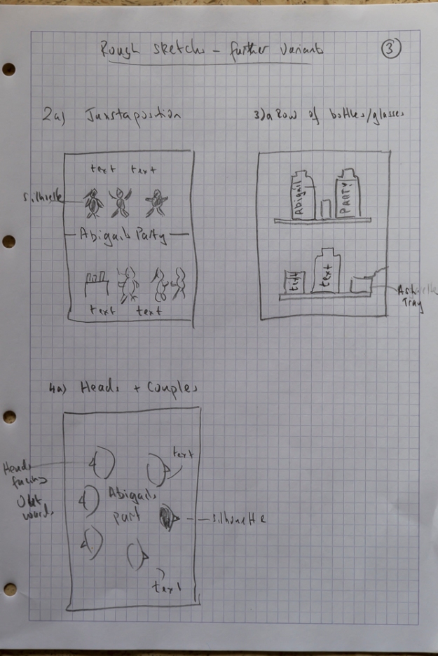
(click to expand)
As I was drawing these up, a few thoughts came to me which fed into my design considerations:
- the idea that the play looks at cliches and so having a poster that reflects this to an extent is appropriate e.g. in use of 1970s fonts
- The need for a design element from the poster to be used in the smaller promotional material.
I considered the draft ideas and discussed with my family and decided to not progress with records (6&7) as this, I felt, did not sufficiently capture the essence of the play.
I then proceeded to make mood boards (using Adobe Illustrator and InDesign) for the remaining ideas which I am now labelling:
a) Necklace in form of the title
b) Juxtaposition of the two parties
c) Row of bottles / glasses
d) Heads
These are my mood boards, there are some commonalities between them since colours and fonts should reflect the 1970s but I have tried to illustrate different possible combinations.


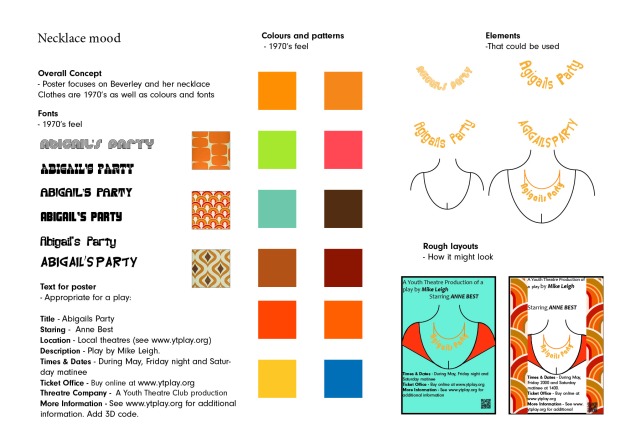
(Click to enlarge)
Looking at the mood boards and discussing with family members I decided to continue with all four variants and create draft versions of the poster and a small version with key design elements that would serve as a basis for the other material.
I created the following:

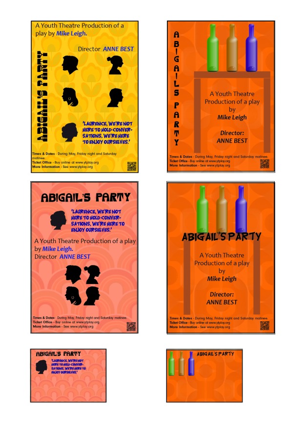
(Click to expand)
These versions all needed additional work but I thought they had sufficient potential to warrant discussion. I asked some friends and my family for feedback and got the following:
- The strongest versions are Necklace and Juxtaposition of the two parties
- Bottles is a little boring, although colours are good
- Could consider changing the background of Juxtaposition of the two parties to that of Heads.
- Need to tighten up on wording and some design points (e.g. the necklace)
- Font used for text succeeds in giving a 1970s feel.
With this feedback I decided to progress with the poster versions of Necklace and Juxtaposition of the two parties, tidying up, making A3 size and then making a final decision between the two.
These are the updated versions:
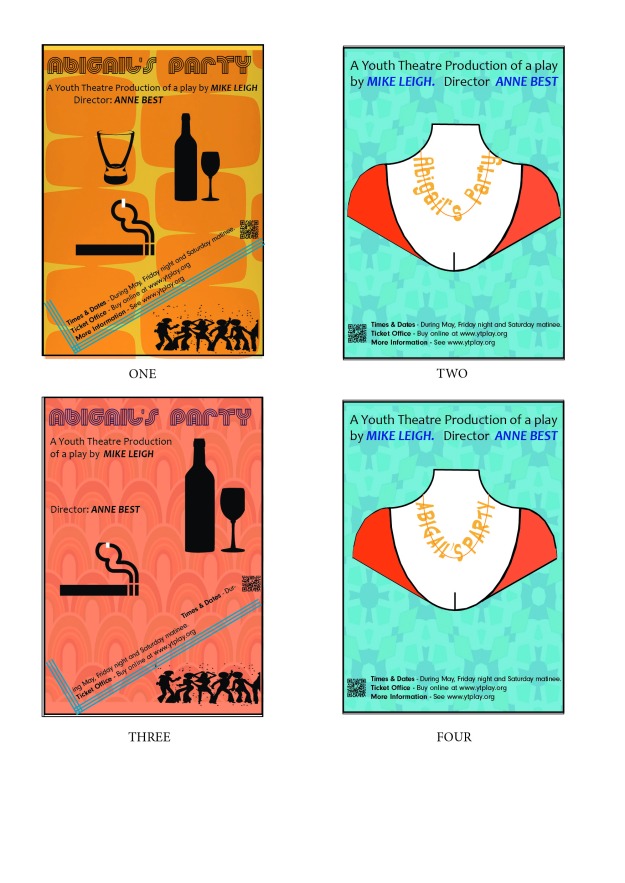
(Click to expand)
I decided that I would base the final design on version FOUR. I think the Necklace concept is more original than the Juxtaposition of the two parties. However I was not convinced that the visual hierarchy was yet correct – the title (as a necklace) needed more emphasis. I adjusted FOUR and then used this as a basis to create versions of the other material. I experimented with minor changes to layout and typography (not recorded) and produced my final results, see below. In producing the smaller format material I had the following considerations:
- Legibility and readability of the different formats
- Relevant information
- Composition
- Consistency of brand
- For the newspaper advert I considered I could make it colour. This is fairly usual with our local newspaper.
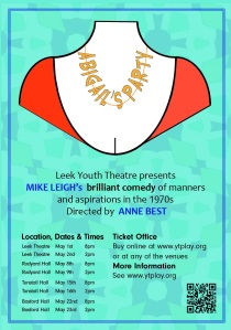
Results
(not to scale)
-

- Poster
-
- Flyer cover
-

- Flyer rear side
-
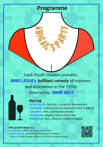
- Programme cover
-

- Advert
(click to enlarge)
Discussion
Research
From the research I learned a lot about what is considered as possible standard content for a poster, flyer and programme cover. As is to be expected, there are no hard-and-fast rules.
The 1970s feel is quite common in designs and there is a lot of material that one can use for ideas.
Design challenges
In terms of overall design I felt I had a range of ideas which I evolved before settling on a final design element (the necklace). In terms of producing the set of design, there was a temptation to reproduce the original poster design but in different formats. However, there is a constraint provided by the fact that each of the media requires different informational content.
For me the greatest technical difficulty was working with Illustrator and learning how to use Paths to fine-adjust the design of the necklace.
Final results
I am quite happy with the final results; they seem to fulfil the brief as well as being aesthetically pleasing. However, I know that I need distance/time from the work to provide objectivity. I will return and review the assignment at a later date, no doubt influenced by my tutors feedback.
Reflection
This section is a summary of the points from above and from supporting log entries. Now that I have two courses behind me (Photography: Expressing Your Vision, and Context & Narrative), I use them as a reference. I have tried to quantify this work by a rating (marks out of ten) in comparison to my previous Photographic EYV, C&N, Graphic Design work and using the overall result from these courses as a guide. I am not attempting to compare against other students working on the same course.
I will also use the OCA assessment structure of:
- Demonstration of technical and visual skills – Materials, techniques, observational
skills, visual awareness, design and compositional skills. (40%) - Quality of outcome – Content, application of knowledge, presentation of work in
a coherent manner, discernment, conceptualisation of thoughts, communication of
ideas. (20%) - Demonstration of creativity – Imagination, experimentation, invention. (20%)
- Context – Reflection, research, critical thinking. (20%)
to provide detailed commentary.
In this section I also discuss the main points of learning that I take away after this assessment.
Demonstration of technical and visual skills
- I think I learnt further features of both Adobe Indesign and Illustrator.
- I do find the composition and colours within the design quite pleasing
(7/10)
Quality of outcome
- I am satisfied my final result and feel it fulfils the brief well. Feedback from both friends and family was very positive
- The blog entries are, I think, a reasonable and coherent description of my approach to the assignment.
(7/10)
Demonstration of creativity
- I felt that there was some creativity in choosing the necklace as a focal point.
(7/10)
Context
- I have performed a large amount of research into a number of areas that supported this work.
- I believe that my analysis is reasonably detailed and honest.
(8/10)
What did I learn
From this assignment I learned a lot; however, the main points for me were:
- The time it takes making small changes to a design.
- The power of adding simple decorative elements to a base design.
- There is diffculty in producing an original design for a topic (play) that has already had much promotional material produced for it. But how original does a design need to be?