
The brief
How many logos can you name? Macdonalds? Nike? Apple? All huge multinational
corporations with millions to spend on building brand recognition. Have a look at logos and
see how they work – pay attention to the colour schemes and simple designs. You will
probably also find that, although you couldn’t recall them immediately when you see them
you immediately recognise them – banks, shops and products. Can you immediately recall
the OCA logo?
Introduction
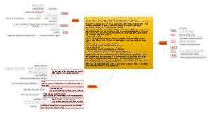
This blog entry records my response to the brief. My attempt at recalling logos; I talk about the research I performed and the conclusions that I made; I discuss this research and what I have learned. I recorded a number of designs and references in my electronic notebook (see here Logos) and show some of them directly here.
Research
After having tried to recall a number of logos (see results below) I decided that I would start looking into award winning logo designs to see if I could find any common factors. I recorded a number of logos (see here Logos) some examples are below. In addition, I revisited some of my previous research and collections (Research: Graphic Designers Research: Examples of Design) where I had looked at logos and designers who had created famous logos.
I show here some examples of famous logos


(Click to enlarge)
Looking at these I identified the following:
- Designs are simple
- Sometimes there is an element (e.g. arrow in FedEx.LG) that is there to be discovered
- Mainly single colours
- Mixture of symbols and text (often involving the name of the company)
After this I looked into advice about creation of logos and found the following:
- Logos can be classified
- The characteristics of a good icon
- Use of colour in icons.
- Process for creating icons
Logo classification (see here):
I was pleased to find that logos follow a classification scheme e.g.

I think I will find this helpful when designing a logo.
Characterisation of a good icon (see here):
The following are regarded as characteristics of good icons.
- is unique and distinctive
- is memorable
- works at any size and anywhere
- reflects the brand identity
- is timeless
This is a good check list, although I suspect the devil is in the detail – how do you quantify reflects the brand identity? Interesting is the practicalelment of being able to be used across media and at differnet sizes.
Use of colour (here) (also see my previous research Colours and Meanings ):
- Red: Red stands for excitement, passion and anger. It’s a great choice if your brand is loud, youthful and wants to stand out.
- Orange: Orange is much less used than red but it’s just as energetic. This is a vibrant, invigorating and playful color.
- Yellow: If you want to look accessible and friendly, yellow is the right choice. It gives off a cheerful, affordable and youthful energy.
- Green: Green is extremely versatile and can work for any brand really. It’s especially perfect for anyone who wants to establish a connection to nature.
- Blue: Blue is a very classic and common choice. It is calming and cool and symbolizes trustworthiness and maturity.
- Purple: Purple can be your ticket to looking luxurious. Depending on the shade, purple can be mysterious, eclectic or feminine.
- Pink: If you’re going for girly, nothing works better than pink. But that’s not all! With shades like pastel rose, millennial pink or neon magenta, pink can give your logo a grown up and cool, but still youthful and feminine look.
- Brown: Brown may sound like a strange colour choice at first, but it works perfectly for rugged and masculine vintage logos. It can give your brand a handmade, unique and aged look.
- Black: If you are looking for a sleek, modern and luxurious look, black will be a great choice. A minimalist black and white logo is the way to go if you want to keep it simple.
- White: You want your logo to look clean, modern and minimalistic? Use lots of white in your logo. As a neutral colour it works in combination with all other colors, but adds a clean, youthful and economical touch.
- Gray: Gray is the ultimate colour if you want to achieve a mature, classic and serious look. Darker shades look more mysterious, while lighter shades are more accessible
Process of creating good icons
There are a number of resources telling how to create icons. The following is a summary, bringing the major points together:
- Define your brand identity – the why of a company, what are the beliefs and values
- Find inspiration for your design – brainstorm, mood boards, think like the audience
- Check out the competition – what are others doing and how does your design set it apart?
- Choose your design style –classic, retro/vintage, modern/minimalistic, fun and quirky, handmade
- Find the right type of logo – what classification (see above)
- Pay attention to colour – See above
- Pick the right typography – align with design style
- Evaluate your logo options – get feedback on options
- (What not to do when designing a logo) – cliched, too complex, too trendy
- Integrate your logo design into your brand – business cards, web, packaging…
Again a useful check list.
Results
I simply sat down and tried for five minutes to recall logos. The following is the list (no order) I created:
McDonalds, Nike, Shell, BP, FT, Toyota, Mercedes, Penguin, Obersaxen, Riehen, Fiat, Apple, Flickr, Microsoft, Lenovo, Intel, Google, IBM, KFC, HP, Syngenta, Novartis, Roche, OCA
I lot of them were technical companies or local organisations. I could recall the OCA logo but I had to think!
Discussion
Recalling Logo’s
I found it difficult to recall logo but was aided by considering industries and important players within the industry. As anticipated seeing a logo it was much easier to say the company it represents. The OCA log is memorable but not, I found, the details.
Characteristics of good icon designs
Is was fun to look at the famous logos to see what are characteristics that they share and then to see what is regarded in the design industry as good. I had an overlap but missed out on the brand identity which is probably the most difficult point to get right. it is probably also a point where the designer puts in levels of interpretation that may or may not be recognised by the viewer either liminally or subliminally.
What did I learn
First and foremost the idea of simplicity and secondly reflecting the brand of the organisation it represents.


; Hotel Eleven (client)")
, Mark McKenzie (art director/designer/writer); Half Price Books (client)")


; Theodore Booker (client)")

